Work today has been kinda slow, & I've had a lot of time to try to work on recreating the study I did roughly a month ago of a yellow cattleya.
 |
| Cattleya Study |
|
|
Oil Pastels are a fairly new medium to me, & I've tried just about every method/process I could find from a Google search about how to use them. Then came the realization that I just needed to keep working with them until I found my
own way. Now I'm at the point where I think I've found my own groove, & wanted to document at least parts of the process I went through... mostly so that I'll have a reference of what's worked & the appearance of each step. SO, here's a few steps I took.
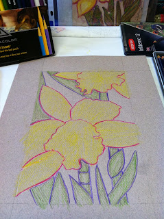 |
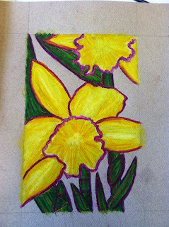
| outline & underpainting prep | | |
|
1. I always choose the size first. The paper is a sheet of 9x12 Canson Mi Teints. The picture size is 6x9. The margins were marked, then the outline (what you see in purple & magenta,) was drawn using Prismacolor Verithin hard lead pencils. After that, a light layer of base colors were added to the blossoms & foliage using Derwent Inktense ink pencils. (If you haven't used these, they are an awesome medium - use like watercolor pencils, but the color is more vibrant, & once dry after washed over with a wet brush, the color is permanent, & won't migrate/bleed.)
 |
| Derwent Inktense Wash |
|
(*NOTE* - if using non-watercolor paper like I did, make sure you work fast & with as little water on the brush as you can so that the paper doesn't warp & become wrinkled.)
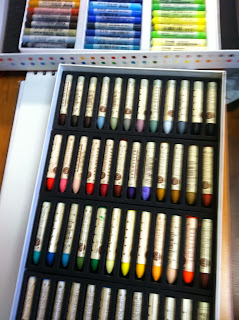 |
| (back) Hard OP's by Erengi, (front) THE KING of OP's, Soft OP's by Sennelier |
|
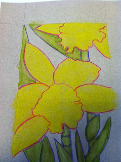
2. When the wash is completely dry, it's time to start applying the pastels. I've found out that the way I work best is to use a harder OP for the first layer or two. My favorite of the harder pastels are Erengi ArtAspirer's. A hard OP will often create a LOT of crumbs; (it's often difficult for me to remember not to try to brush them off with my hand) I remove the large crumbs with a dry, stiff brush, then use my favorite pastel tool - a Color Shaper - to do an initial blending.
When I'm ready to move on to the softer OP's, I use the Color Shaper to make sure all the tooth is filled in & the surfaces covered are smooth. This is a personal preference.
 |
| first layer - blended & finished |
|
3. Now it's time to move on to the softer, smoother, beautifully creamy soft OP's. My favorites, & the ones I used in this picture are Sennelier. Detail, detail, detail... tiny amount of blending... a little more detail & color... remove crumbs.. & VOILA!
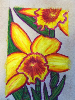 |
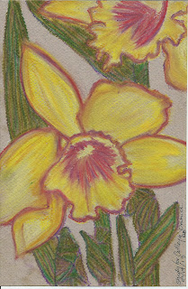
| finished!!! | |
I'm pretty certain I've overworked this...
My main problem with creating any sort of work in general is knowing when it is finished. Sometimes I go too far, other times I don't go far enough. HOWEVER, I do love the brightness of this, & the colors I used. So I'm satisfied - & that's huge.


No comments:
Post a Comment